Designed an image-forward e-commerce experience that evolved alongside a changing brand and business direction.
E-commerceVisual DesignCLIENT
Anthony Jasper / Kieran James15 DaysDesigner, Frontend DeveloperPaint.net
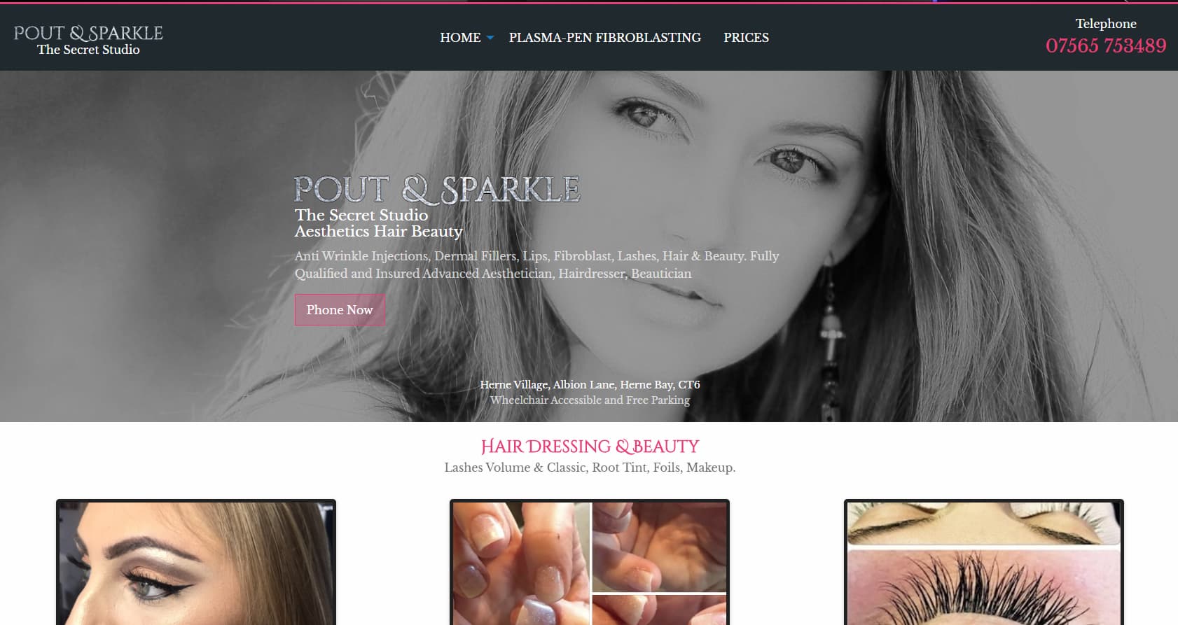
Pout & Sparkle is a website designed to promote and sell aesthetic products. Since launch, the project went through multiple redesigns and refinements due to the client closing and restarting the business, alongside evolving ideas around content and layout.
The focus of this iteration was to create a visually driven design that appealed to a female audience, with strong emphasis on imagery and brand-led styling.
Pout & Sparkle is a beauty-focused business that experienced multiple restarts and shifts in direction, making consistency and clarity a core challenge. The goal was to design a website that could promote and sell aesthetic products while remaining flexible enough to accommodate changing requirements and business decisions.
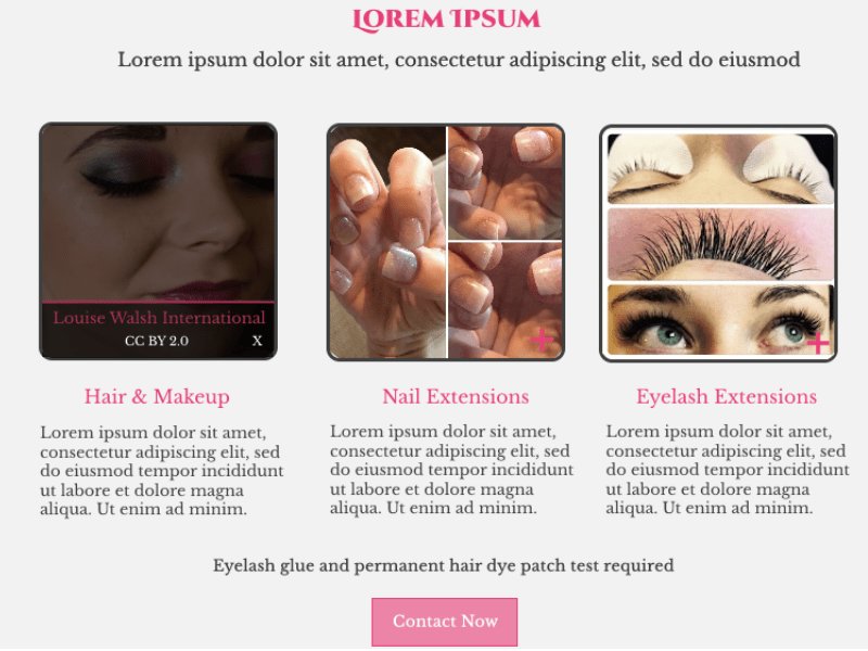
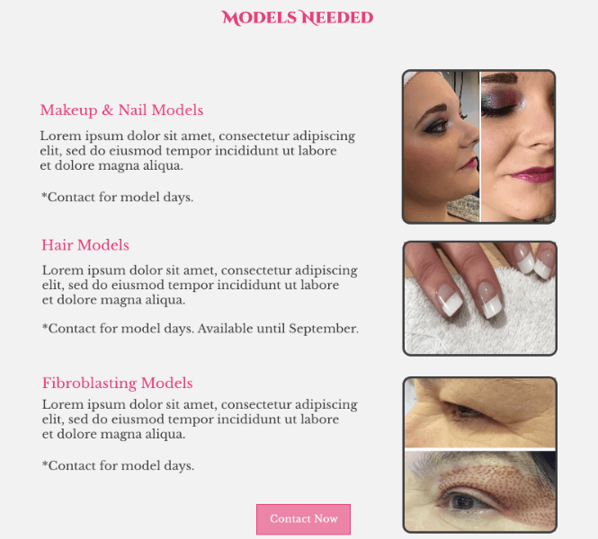
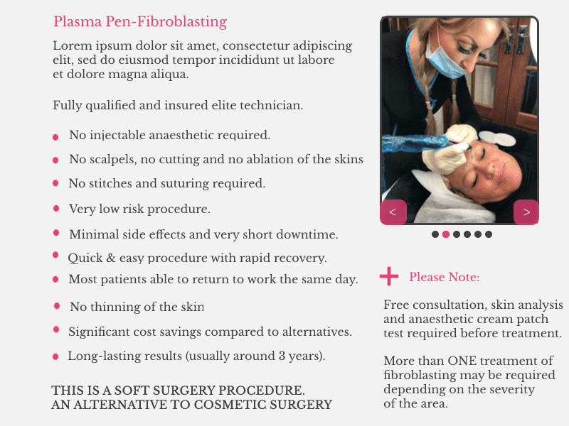
The design needed to appeal to a predominantly female audience, rely heavily on imagery, and clearly highlight key areas the client considered most important, without overwhelming users or diluting the brand’s visual identity.
Pink was selected as the primary accent colour due to its strong association with glamour and beauty—key qualities the brand wanted to convey. It was paired with a light grey background to create contrast and allow the accent colour to clearly guide attention toward important sections and calls to action.
This balance helped the interface remain visually soft while still directing users toward priority content.
Two serif typefaces were used to reinforce the aesthetic-focused nature of the brand. A simpler serif was applied to body text to maintain readability, while a more stylised serif was reserved for headings to add character and align with the overall visual tone.
This combination allowed hierarchy to be established without introducing excessive visual noise.
An accordion component was used to display supplementary information that could not fit within the layout without disruption. With hindsight, this was not the most appropriate use of the pattern, as the content would have been clearer and more accessible as a visible notice at the top of the section.
This project highlighted the importance of choosing design patterns based on content priority, not just spatial constraints.
Other Design Patterns:
Carousel
Home Link
Choose Your Path
The Good
Game UIInteractive DesignPERSONAL
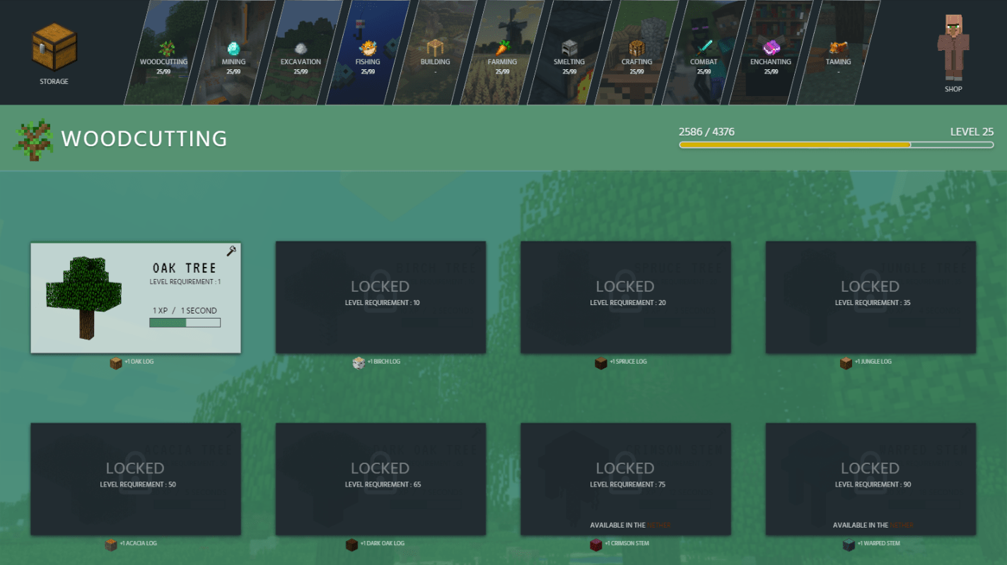
Minecraft Idle
Web-based idle game designed around passive interaction and strategic decision-making.