Anthony Jasper
Designer
UXpin
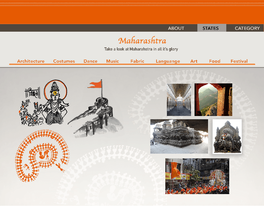
The purpose of this design was to help a student that was studying web design in college who asked me for some help. My aim was to show her how to separate out sections of the site, how colours are important to bring attention and how to get the user to view the site you intended them to.
7
Development - Days
1
Design Patterns
0
Expected Users - Month
0
Live - Days
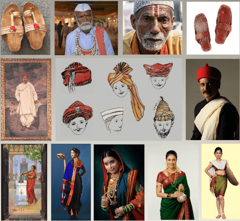
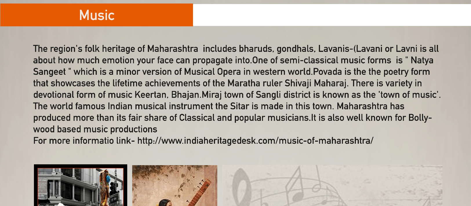
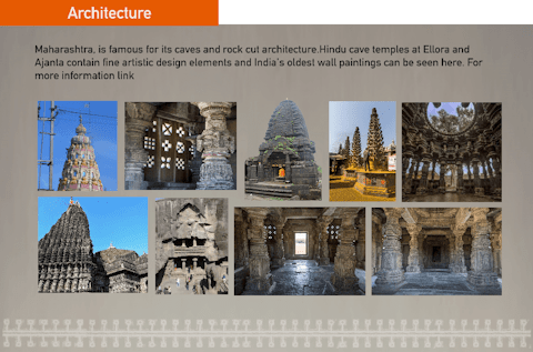
The colour orange was chosen to be the accent colour of the design because it is one of the colours used for the Indian flag. It is also one of the main colours that when talking about India, orange is most associated with. A grey colour was used for the sections backgrounds to resemble some of the architecture used within some of the images but it also allowed the contrast of the orange to stand out against it.

A Serif font for the headings to go with the costumes and dance culture of India. A sans serif to be used for the rest of the text as well as a little of weight added to it to give it that strong bond between their families and language. It also helps with the contrast against the grey background and colourful pictures it's occasionally used with.

Gallery. Instead of using a single view, navigational gallery, a more grid layout gallery is used to bundle all of the content in a single viewing. This allows the gallery to display different sized images in a more condensed way, allowing for an easier time viewing them.

